Rental LED displays in luxury retail: how to integrate them discreetly
Luxury retail spaces are designed to feel intentional, calm and premium. Rental LED screens can belong in that environment—but only when the display, mounting, cable routes and colour calibration are treated as part of the interior architecture, not added as a last-minute hire item.
This guide is written for retail design agencies planning temporary in-store campaigns. It explains how to scope a discreet rental LED wall so the screen supports the story, protects the space, and looks built-in from every angle.
Discreet rental LED integration in luxury retail means the screen reads as part of the architecture: clean edges, invisible cabling, calm mounting, and colour/brightness calibrated to the store lighting. Start with a decision brief, lock sightlines and cable routes early, then commission using real products in real lighting.
Key takeaways
Discreet rental LED integration is achieved by controlling edges, cable routes, colour calibration and sightlines, not by “hiding the screen”.
Correlated colour temperature (CCT) and colour rendering (CRI) must be planned alongside store lighting, because LED walls are light sources as well as display surfaces.
The most common failure mode in luxury retail installs is visible infrastructure (stands, truss, cables, PSU boxes), not pixel quality.
A site survey should lock in structure, access, power, data and stakeholder approvals before content production starts.
Commissioning is where the “luxury feel” is won or lost: we align brightness, white point and colour profile to the space, then validate with real product and real camera conditions where relevant.
At a glance
Environment: luxury retail, visual merchandising, temporary campaigns, showroom-quality finishes
Primary risk: visible mounting/cabling and colour mismatch with ambient lighting
Typical constraints: heritage or landlord restrictions, limited out-of-hours windows, sensitive surfaces, tight sightlines
Best practice: treat the LED wall as part of the interior architecture and lighting plan, with a documented brief and sign-off process
What does “discreet” rental LED integration mean in luxury retail?
Discreet integration means the LED display feels intentional in the space: the edges are clean, cables are invisible, the mounting looks architectural, and the on-screen colour and brightness match the store’s lighting mood.
In practical terms, we look for four “tells” that make a temporary LED install feel temporary, and remove them:
Visible structure: bulky stands, truss, floor plates, ballast.
Visible services: dangling power, data loops, adaptor blocks.
Unmanaged edges: chunky bezels, uneven seams, exposed corners.
Colour mismatch: whites that look too cool or too clinical against warm luxury lighting.
Start with a decision brief before you choose a screen
The fastest way to get a premium result is to agree a short decision brief with the agency, brand team and site stakeholders before choosing pixel pitch, cabinet type or mounting method.
A good brief prevents late-stage compromises like “we can’t drill there”, “that wall isn’t structural”, or “the content doesn’t feel like the store”.
| What to confirm | Why it matters | What we ask you to provide |
|---|---|---|
| Nearest viewing distance and key sightlines | Drives pixel pitch, screen height, and how visible seams/edges will be. | Floorplan with customer flow and primary viewing positions marked. |
| Ambient lighting intent | LED walls emit light; colour temperature and brightness must harmonise with store lighting. | Lighting schedule or a quick on-site walk-through with the lighting designer. |
| Fixing substrate and load paths | Determines whether we can wall-mount, recess, or need a self-supporting structure. | Wall build-up details, landlord restrictions, and any “no-fix” zones. |
| Power availability and cable routes | Visible cables are a luxury killer; hidden routes must be planned early. | Power locations, permitted routes, and a preferred concealment approach. |
| Data/network constraints | Playback stability depends on clean signal paths and realistic handover expectations. | Content source plan (local player, CMS, live feed) and network policy if applicable. |
| Install/de-rig windows and access | Out-of-hours rules drive logistics, crew plan, and risk controls. | Access times, loading route, lift limits, and any noise/dust constraints. |
| Content approval process | Content pacing and colour decisions often need sign-off from multiple stakeholders. | Named approver(s), deadlines, and the required test preview method. |
Case study: Canada Goose flagship window LED displays (London Regent Street & Munich)
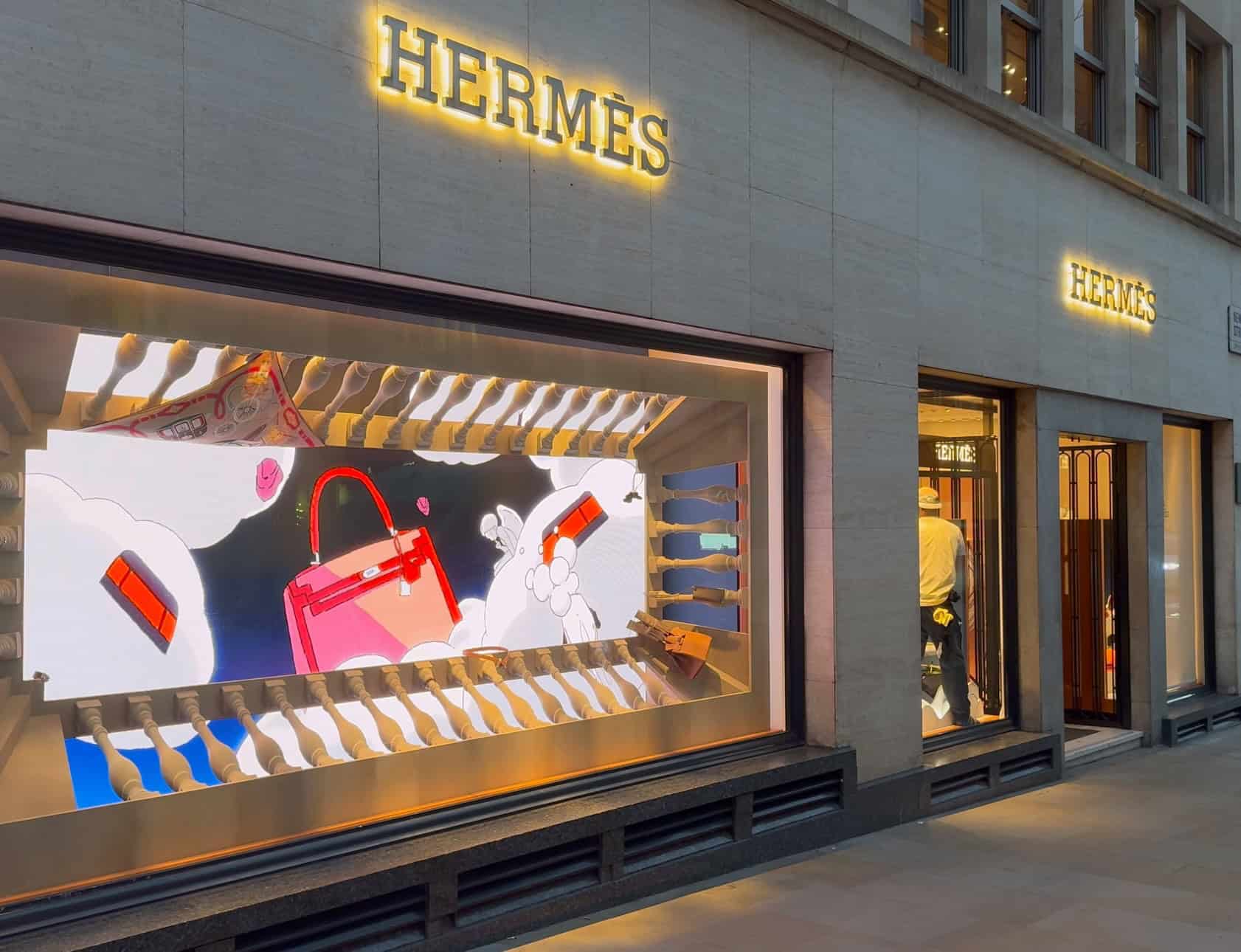
Window-facing LED is where “discreet integration” is tested hardest: direct daylight, reflections, tight viewing distances, and very limited installation windows. This Canada Goose project shows the practical decisions that protect premium brand presentation when the screen must perform through glass and still look intentional up close. (While this was a bespoke window install, the same discretion-first principles apply to luxury retail rental LED campaigns—especially for short, window-led activations.)
Project snapshot
- Client: Canada Goose
- Locations: Flagship stores in Munich and London (Regent Street)
- Application: High-brightness, window-facing LED displays designed to remain crisp at close range
- Creative context: Displays supported Canada Goose’s collaboration with UAL Central Saint Martins
- Installation approach: Both installs completed overnight to protect trading hours
The brief
The brief demanded an immersive retail window display that could cut through bright, urban daylight but still appear clean and premium when viewed from just a metre or two away. In practice, that means specifying the wall for near-field clarity and daylight legibility, then commissioning it so brightness and colour feel controlled—not “over-driven”.
Challenges unique to luxury retail windows
- Direct sun + reflections: content must hold contrast through glass in changing ambient light.
- Thermal loading: solar gain behind glazing needs to be considered during design.
- Close viewing distances: type, texture and product detail can’t fall apart up close.
- Limited access / short install windows: serviceability and clean cable management matter because fixes often happen out of hours.
What we delivered
- Two custom LED window installations (Munich + London), engineered around a fine 2.6 mm pixel pitch for close-up clarity.
- Window-class brightness specification (designed for >3,500 nits) to maintain daylight readability.
- High-refresh drivers to preserve motion fidelity in video content and reduce visible scan artefacts.
- Front-service access and disciplined cable management to support rapid out-of-hours maintenance.
- NovaStar-based control workflow used for scheduling, colour management and remote diagnostics.
Key specifications (at a glance)
| Site | Screen size | Pixel pitch | Window-facing | Install window | Brightness class | Control workflow |
|---|---|---|---|---|---|---|
| Munich flagship | 2.75 m (W) × 2.5 m (H) | 2.6 mm | Yes (daylight readable) | Overnight, 10 September 2025 | Designed for >3,500 nits | NovaStar (Dynamo workflow) |
| London (Regent Street) | 5.0 m (W) × 2.5 m (H) | 2.6 mm | Yes (daylight readable) | Overnight, 16 September 2025 | Designed for >3,500 nits | NovaStar (Dynamo workflow) |
Commissioning: where the “luxury feel” is won
For window installs, we don’t treat commissioning as a quick “brightness up / brightness down” adjustment. At Regent Street we measured ambient light conditions through the day, then tuned a brightness curve so content stayed vivid without blooming whites. We also pre-graded creative assets to keep skin tones natural while preserving garment detail—because luxury visuals fail quickly if whites clip or subtle material textures disappear.
“Window installs live or die by daylight balance.” — Daniel Reynolds
Outcome (what this demonstrates for luxury retail LED integration)
- Daylight legibility without harshness: window-class brightness paired with controlled calibration.
- Close-range premium detail: fine pixel pitch for crisp typography and clean product texture from short viewing distances.
- Motion that holds up on camera: high-refresh drivers to maintain smoothness and reduce scan artefacts.
- Operational realism: overnight delivery with a disciplined pre-build, commissioning and QC process so both stores could trade the next morning.
Read the full case study: LED Window Displays for Canada Goose
Specification starting points (without over-committing)
Every luxury retail space is different (sightlines, lighting, glazing, content style, camera use), so we always confirm specification after a quick site survey. That said, the starting points below help you shortlist the right direction fast.
Pixel pitch: starting points by typical viewing distance
Use this as a “first pass”. The key input is the nearest typical viewing distance (not the farthest).
| Nearest typical viewing distance | Starting-point pixel pitch | Common luxury retail use | Notes |
|---|---|---|---|
| 0.5–1.5m | 0.9–1.2mm | Close-up product storytelling, premium feature walls | Best where guests stand close and you want “print-like” detail. |
| 1.5–3m | 1.2–1.8mm | Boutique walls, POS backdrops, brand moments | Often the sweet spot for many luxury interiors. |
| 3–5m | 1.8–2.6mm | Wider walls, mid-store sightlines | Good balance of impact and value when viewing is slightly farther back. |
| 5–8m | 2.6–3.9mm | Large open spaces, atrium views, big feature walls | Ideal when the nearest viewer isn’t right up against the display. |
| 8m+ | 3.9mm+ | Long-throw viewing, very large formats | Best when the wall is primarily seen at distance. |
Practical rule of thumb: choose pixel pitch so the pixel structure isn’t distracting at your nearest viewing point. If people can walk right up to the wall, prioritise finer pitch.
Brightness: interior vs window-facing considerations
Brightness is measured in nits (cd/m²). We aim for “premium visible” without looking harsh or washing out merchandise.
- Interior feature wall (controlled lighting): typically 600–1,200 nits is plenty, especially with good content grading and correct gamma.
- Bright interior / near glazing (strong ambient light): often 1,200–2,500 nits helps maintain contrast.
- Window-facing / outward to street: commonly 2,500–5,000+ nits depending on orientation, daylight, and reflections.
- Must-have for retail: automatic brightness control (light sensor + scheduling) so it’s comfortable at night and consistent during the day.
We always check the glass type, sun path, and reflections — a “too bright” screen can look cheaper, not more premium.
Refresh rate: when cameras / social capture matters
If your LED wall will appear on smartphones, influencer content, live streams, or professional cameras, camera performance matters as much as resolution.
- Baseline for retail: target 3,840Hz+ refresh with solid greyscale performance and proper calibration for clean gradients.
- Frequent filming / VIP events / pro cameras: consider 7,680Hz+ (plus suitable scan rate and processing) to reduce flicker/banding risk.
- What really prevents “camera artefacts”: refresh rate and scan rate, PWM behaviour, processor settings, shutter angle, and how the content is rendered.
- Best practice: do a quick on-site camera test with the actual phones/cameras that will be used.
Quick “spec inputs” we use to lock the right solution
- Nearest viewing distance + key sightlines (where people naturally stop)
- Ambient light levels (day vs evening) and whether the wall faces glazing
- Primary content type (product video, motion graphics, text, live feeds)
- Camera use (phones only vs professional filming / broadcast)
- Service access (front-service vs rear access), ventilation, and noise/heat limits
If you share your approximate viewing distances and whether the wall is interior or window-facing, we can recommend the most suitable pitch/brightness/processing combination for a luxury finish.
Mini-FAQ (high-intent)
What’s the best pixel pitch for luxury retail?
In most luxury interiors, the decision is driven by the nearest viewer. As a starting point, we often look at 1.2–1.8mm for boutique feature walls, and 0.9–1.2mm where guests stand very close.
What viewing distance do I need for a given pitch?
A practical starting point is to match the pitch to your nearest typical viewing distance using the table above, then confirm with a sightline check (and ideally a quick sample/viewing test).
How bright should an LED wall be in a shop window?
Window-facing screens often need higher brightness to compete with daylight (commonly 2,500–5,000+ nits), but they should also have automatic dimming so they look premium and comfortable in the evening.
Colour and light management for premium product visuals
Premium visual results come from managing LED output like a lighting instrument, not just a “screen setting”. Correlated colour temperature (CCT) and colour rendering (often expressed as CRI, Colour Rendering Index) are the two concepts that most affect how products look in-store.
Correlated colour temperature (CCT)
CCT describes whether “white” appears warm or cool, measured in Kelvin (K). A common definition is the temperature of a blackbody whose colour most closely matches the light source.
In luxury retail, the practical rule is simple: the LED wall’s white point must be chosen to complement the store lighting, not fight it.
What we do in practice:
Observe existing lighting at the display location (spotlights, coves, daylight spill).
Set a target white point and test it against real products (leather, cosmetics, jewellery, packaging).
Balance the LED wall brightness so it feels like part of the environment, not a separate light source.
Warm “boutique” atmospheres often sit around 3000K in lighting design contexts, but the correct value depends on the brand and materials.
Colour rendering and CRI
CRI is a method of rating how faithfully colours are rendered compared with a reference illuminant, and it is defined via standardised measurement methods.
For luxury product presentation, colour rendering is not a “nice to have”. If reds, skin tones, or subtle fabric hues shift, the product can look wrong even when the content file is correct.
What we do in practice:
Calibrate the screen’s colour profile during commissioning.
Validate with real product materials (not just a colour bar pattern).
If camera capture matters (press, social, live content), we test for moiré, banding and shutter interaction during the same session.
Safety and comfort considerations
LED displays should be assessed and operated responsibly because they are bright light sources. Photobiological safety standards exist for light sources and luminaires, including the BS EN IEC 62471 family.
The useful takeaway for retail agencies: plan brightness and viewing conditions so the content looks premium and comfortable, and avoid “over-driving” brightness indoors unless the environment genuinely requires it (for example, window-facing applications).
Hardware that looks intentional: surface, seam, frame and finish
A luxury space will highlight every edge and every mismatch in materials. Discreet integration is often won at the boundaries: frame finish, trims, corner details and how the screen meets the surrounding architecture.
A rental LED wall looks “built-in” when the viewer cannot visually separate the screen from the interior finish palette.
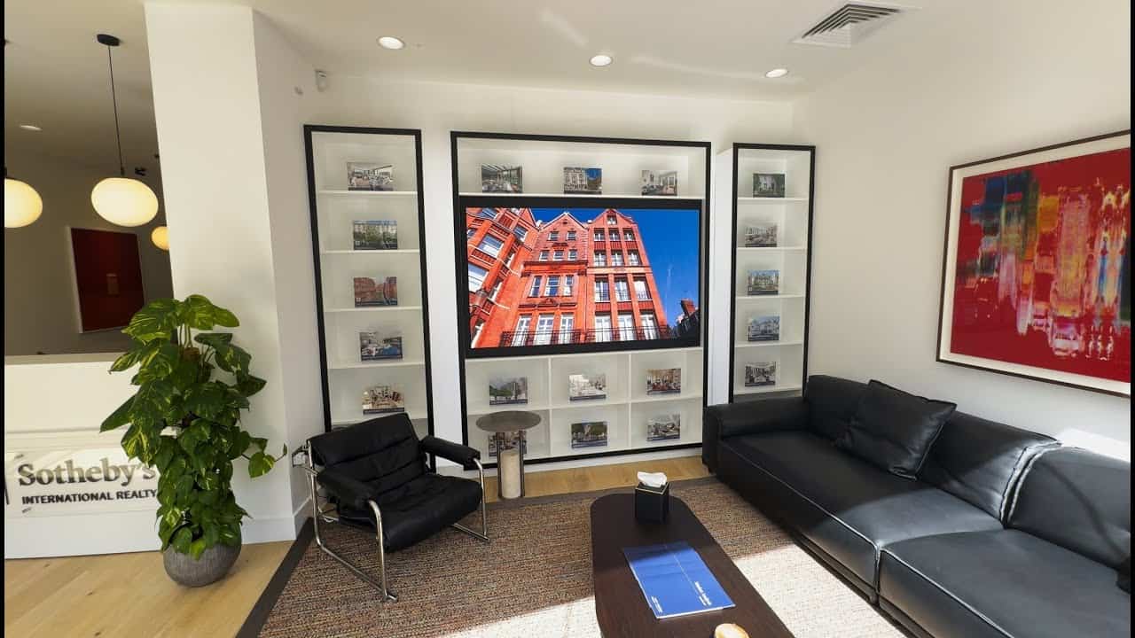
Practical approaches we use (project-dependent):
A trim strategy: define a clean perimeter detail (shadow gap, matching surround, or flush integration).
Material alignment: match visible framing to nearby metals/paintwork (for example, powder-coated trims to joinery colourways).
Surface protection choices: in high-touch areas or fast turnaround retail environments, protective surface solutions can reduce the risk of visible damage and simplify cleaning routines.
Seam discipline: screen flatness, module alignment, and consistent cabinet locking reduce visual “tiling”.
If your build uses exhibition frameworks, we can also specify systems where appropriate; for example, our DRE series is compatible with BeMatrix and Aluvision frameworks.
Invisible engineering: mounting, cable routes, and access
Invisible engineering means the customer sees the content, not the infrastructure. The mount must be safe and stable, but it also must be visually quiet.
The best mounting solution is the one that meets the space constraints and disappears into the architecture.
Common mounting approaches for luxury retail campaigns
We typically choose between (or combine) the following approaches:
Self-supporting structure (dressed): a freestanding build with a properly finished surround so the structure reads as a design feature, not a hire frame.
Wall-mounted to a client-provided structure: if the site provides a suitable, confirmed substrate, the screen can mount cleanly with minimal visible framework. (Our DX Series is designed to support direct wall mounting when the client provides a simple wall structure.)
Recessed: a cavity or false wall that lets the LED sit flush and creates a “built-in” look.
Suspended/feature installs: used sparingly in luxury settings, where the architecture supports it and cable routes can be concealed.
Cable management rules that keep the install premium
Cable management is not “tidy-up at the end”. It is designed.
Our rules of thumb:
Decide the cable route before the screen goes up.
Avoid visible service loops on public-facing sides.
Separate data and power neatly and protect contact points.
Ensure service access remains possible without dismantling surrounding joinery.
Service access and maintenance planning
Discreet installs still need practical access for:
commissioning adjustments,
content changes,
fault resolution,
de-rig efficiency.
We document access points and service steps so the campaign team is not improvising in a finished retail environment.
Content and playback: how to make motion feel premium
Luxury retail content should feel calm, intentional and paced for the space. A screen can be physically perfect and still feel wrong if the motion language is too aggressive for the environment.
Premium LED content respects the store’s tempo. It supports product and atmosphere rather than demanding attention.
Practical content strategies we see work well:
Ambient motion: slow movement that adds depth without turning the screen into the loudest object in the room.
Use of negative space: planned “quiet moments” help products remain the hero.
Context-aware storytelling: content that complements the product zone (materials, colour palette, campaign narrative).
Control systems and CMS workflow
A stable playback chain is part of the luxury experience. We regularly commission systems using NovaStar and Brompton control platforms, depending on the technical requirements of the project.
Where content updates are needed during a campaign, Dynamo CMS can be used either:
Cloud-based access: remote content management from anywhere with an internet connection.
Local connection: on-site updates and scheduling without relying on constant internet access.
How we run a luxury retail rental LED project
A well-run hire project feels calm on-site because decisions have been made in advance and documented clearly.
Our process is designed to protect the store, protect the finish, and deliver predictable visual results.
A typical workflow looks like this:
Discovery: understand campaign goals, environment, and creative intent.
Site survey: confirm substrate, access, power/data, and any landlord or heritage constraints.
Design pack: mounting concept, cable plan, screen layout, and a commissioning plan.
Pre-build and test: confirm the screen build, mapping, and playback before arriving on site.
Install (often out of hours): clean working practices, controlled unpacking, protected surfaces.
Commissioning: brightness, white point, colour profile, content tests.
Handover: agreed operating plan, content update procedure, and de-rig plan.
De-rig: remove cleanly and leave the space as found.
From the field: Daniel Reynolds on “discretion-first” installs
When we’re working in luxury retail, we treat every visible detail as part of the brand experience. That means we plan trims, cable routes and service access just as carefully as pixel pitch.
In practice, the best projects are the ones where the agency, lighting designer and site team align early. Once we’ve agreed sightlines, white point and the physical boundary detail, the install becomes predictable and the screen simply feels like it belongs.
Choosing an LED hire partner: questions retail design agencies should ask
A supplier who can hang a screen is not automatically a partner who can integrate one into a premium interior.
The right LED screen hire partner behaves like a technical collaborator. They will ask the uncomfortable questions early, and document answers.
Use this checklist when vetting suppliers:
Can you show examples of discreet perimeter trims and concealed cable routing?
What is your approach to site surveys and substrate verification?
How do you handle landlord and heritage constraints (non-invasive mounting, protection measures)?
What is your colour calibration and commissioning process, and who signs it off?
How do you plan service access for a clean campaign run?
What content formats do you prefer, and how do you test playback before install?
What is your escalation route during the live campaign period?
Common pitfalls and how to avoid them
Most luxury retail LED issues are avoidable with a tighter brief and a more disciplined install plan.
If you want the LED to feel premium, avoid these common traps:
Designing content before fixing the screen’s white point and brightness target.
Assuming “the wall is fine” without confirming substrate and load paths.
Leaving cable routing decisions until the end of installation.
Underestimating the visual impact of trims, corners and edges.
Choosing motion content that suits trade shows, not boutiques.
Not planning service access, then having to “break the look” to fix something.
References (external)
CIE publication on the method for measuring/specifying colour rendering (CRI).
US Department of Energy (SSL) overview of correlated colour temperature methods and definitions.
CIBSE Journal CPD module referencing warm white CCT context (around 3000K).
BSI listing for BS EN IEC 62471-7 (photobiological safety of light sources and luminaires).
CIBSE/SLL Lighting Guide 17 (Lighting for retail premises) overview page.
How do we integrate a rental LED screen in a luxury store without it looking temporary?
Discreet integration comes from edge detailing, concealed cable routes, calm mounting solutions, and colour calibration that matches the store lighting. The goal is for the screen to read as part of the architecture.
Will a temporary LED installation damage high-end finishes?
A competent supplier should design a mounting method that protects finishes and avoids unnecessary fixings. A site survey and a documented fixing plan are essential before any install.
How do you match on-screen colours to brand guidelines in-store?
We calibrate the LED wall during commissioning and validate against real products and lighting conditions, not just test patterns. If strict colour matching is required, we agree the sign-off method and reference conditions before content production.
What should we confirm on site before committing to a screen specification?
Confirm viewing distance and sightlines, substrate and load paths, cable routes, power/data locations, access windows, and stakeholder approvals. A short decision brief prevents late-stage compromises.
What content style works best for luxury retail LED walls?
Content that is paced for the space generally performs best: slower motion, controlled brightness, and deliberate use of negative space. The screen should support product and atmosphere rather than dominate the room.
Can a rental LED wall be built to a custom size or shape?
Yes. LED systems are modular, so displays can often be configured to match specific dimensions or create features such as columns, corners or curved sections, subject to safe mounting and sightline constraints.
Do we need a content management system (CMS) for a short campaign?
Not always, but a CMS helps if content needs to change during the campaign. Dynamo CMS can be used via cloud access for remote management or via a local connection for on-site updates.
Talk to Dynamo LED Displays
If you want a rental LED installation that feels like it belongs in a luxury interior, we can help you scope it properly from day one.
Call us on +44 (0)203 489 9878 and we’ll arrange a consultation.
You can also reach us via our contact page.
Locations
London HQ: 146a Brick Lane, London, E1 6RU, England, GB
Oxfordshire office: Rowan House, Long Toll, Oxfordshire, RG8 0RR, Oxfordshire, GB
Trust signals
Written by: Daniel Reynolds, Managing Director, Dynamo LED Displays (IPAF, PASMA, CSCS)
Technical review: Tristan Grant, Senior LED Engineer
Published: 10 February 2026