Skip to content
Why Does the Sunset on Your Screen Look… Wrong? A Guide to Colour Depth
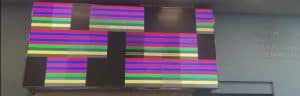
Have you ever admired a stunning image on a large screen—a tranquil blue sky, a vibrant sunset, or a sleek product photo—only to notice something wasn’t quite right? Instead of a smooth, seamless gradient of colour, you see distinct, chunky bands. It’s a subtle but jarring effect that can cheapen an otherwise high-quality visual. As the UK’s leading LED screen suppliers we have years of experience and expert knowledge in this field
This common issue isn’t about the number of pixels; it’s about the quality of those pixels. The culprit? Something called colour depth, also known as bit depth.
Think of it as the secret ingredient that separates amateur visuals from professional, breathtaking displays. Understanding it is the first step towards ensuring your visual content looks exactly as intended. This guide will take you through everything you need to know, from the basics to the professional nuances, transforming you from a casual observer into an informed expert.
Foundation: The Building Blocks of Digital Colour
Before we dive into colour depth, let’s first understand how a screen creates colour. Every image on an LED display is made up of thousands or even millions of tiny dots called pixels. Each pixel contains three smaller light sources: one red, one green, and one blue (RGB).
To create a specific colour, the screen instructs each of these red, green, and blue lights on how brightly to shine. But how does it communicate this? It uses bits.
A bit is the most basic unit of digital information—a simple on/off switch, represented as a 1 or a 0. By combining these bits, a computer can represent more complex instructions. When it comes to colour, the number of bits assigned to each red, green, and blue subpixel determines how many brightness levels it can produce. This is what we call colour depth.
Let’s use an analogy. Imagine you’re building a ramp from the ground (black) to a platform (full colour):
- Low Bit Depth: You only have a few large steps. The transition is clunky and visibly stepped.
- High Bit Depth: You have many, many small steps. The transition is so smooth it looks like a perfect, seamless ramp.
This is exactly how bit depth works. More bits create more “steps” of colour, resulting in smoother gradients.
The ‘Staircase’ Analogy
The staircase analogy helps illustrate how bit depth affects the smoothness of colour transitions. More bits mean more steps between black and full colour, reducing visible banding and creating smoother images on LED screens.
The most common bit depths are 8-bit and 10-bit:
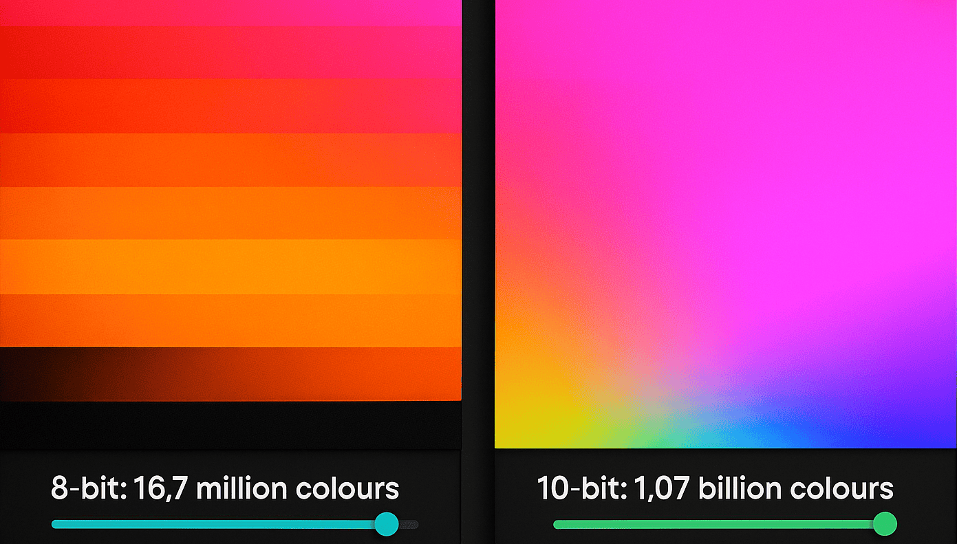
- 8-bit colour: Uses 8 bits per channel (R, G, and B). This gives each channel 2⁸, or 256, possible steps. When combined, this allows for 256 x 256 x 256 = 16.7 million total colours.
- 10-bit colour: Uses 10 bits per channel. This gives each channel 2¹⁰, or 1,024, possible steps. The total number of colours skyrockets to 1,024 x 1,024 x 1,024 = 1.07 billion colours.
Understanding these foundational parameters is key to diagnosing and demanding better image quality.

Building: The 8-bit vs. 10-bit Showdown
One billion colours sounds impressive, but what does it actually look like? The difference is most noticeable in those smooth gradients we mentioned. With only 256 steps per colour, an 8-bit display can struggle to render subtle transitions, resulting in visible “banding.” A 10-bit display, with its 1,024 steps, has more than enough data to create a flawless, lifelike gradient.
Demystifying “8-bit + FRC”
You may come across displays marketed as “10-bit” that are actually 8-bit + FRC. FRC stands for Frame Rate Control. It’s a clever technique where an 8-bit panel rapidly flickers between two adjacent colour shades to simulate the shade that lies between them. It happens so quickly that your eye is tricked into seeing a colour the panel can’t technically produce. While not a “true” 10-bit experience, it’s an effective way to reduce banding and is a significant improvement over standard 8-bit.
The Human Eye Fallacy: “If We Only See 10 Million Colours, Why Does 1 Billion Matter?”
This is a fantastic question. It’s true that the human eye can distinguish approximately 10 million colours. So, why would we ever need the 1.07 billion offered by 10-bit?
The answer lies not in seeing more colours, but in having more shades in between the colours we can see. The 1 billion colours of a 10-bit display fill in the gaps that cause banding on an 8-bit screen. It’s about achieving mathematical precision to produce a visually perfect image, free from digital artefacts that our eyes are surprisingly good at spotting.
Mastery: Professional Considerations for Perfect Colour
For professionals in broadcast, virtual production, or high-end retail, achieving perfect colour goes even deeper. Two factors can significantly impact the effective bit depth of your display: brightness and the processing chain.
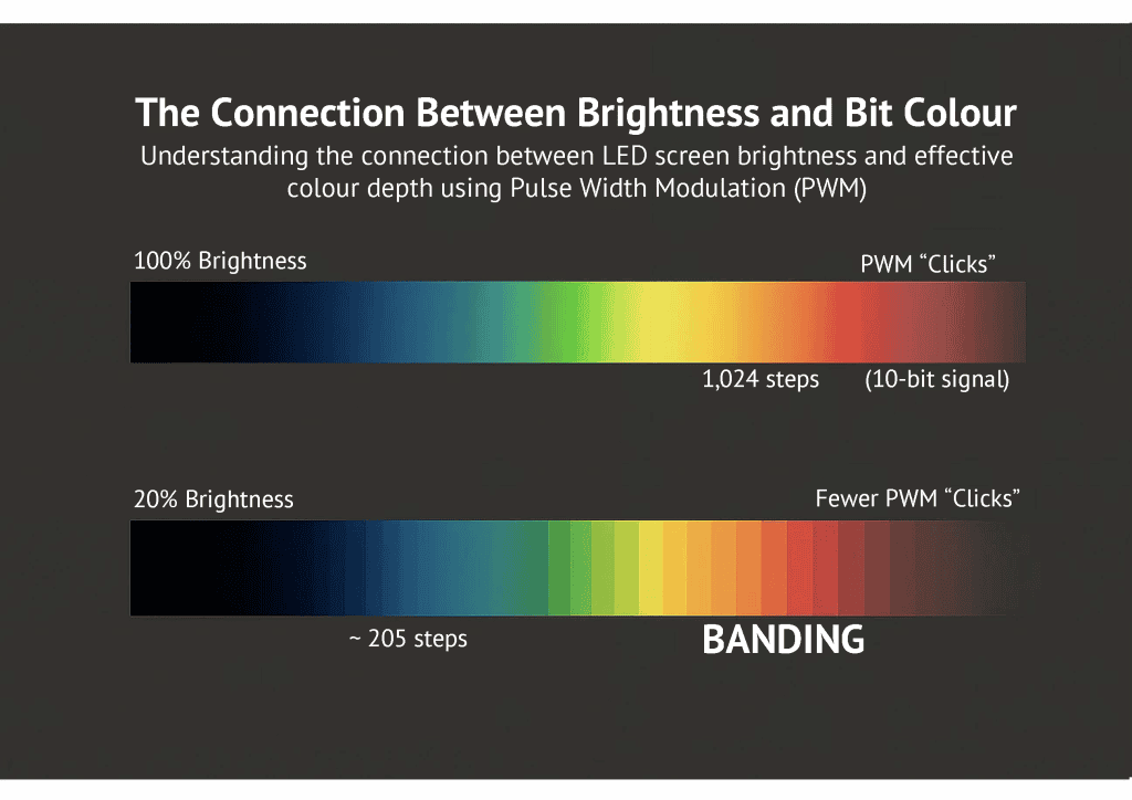
The Connection Between Brightness and Bit Depth
Here’s an “aha moment” that even many industry pros miss: lowering the brightness of an LED screen can reduce its effective colour depth.
LEDs create different levels of brightness using a technique called Pulse Width Modulation (PWM). Instead of dimming like a traditional bulb, an LED flashes on and off thousands of times per second. To create a dimmer light, it stays “off” for longer during each cycle.
Think of it like a dimmer switch with a limited number of “clicks” available:
- At 100% brightness, your LED has all its available PWM “clicks” to create the 1,024 steps of a 10-bit signal.
- When you lower the brightness to 20%, you drastically reduce the number of available “clicks.” The processor now has to compress those 1,024 steps into a much smaller range, effectively “losing bits” and reintroducing the risk of banding.
This is why high-end LED processors and panels are critical for broadcast environments, where screens are often run at very low brightness to match camera settings. They employ advanced processing to preserve colour depth even in dimmed conditions.
The Alphabet Soup: Bit Depth, Colour Gamut, and HDR
These three terms are often used together, but they describe different things:
- Bit Depth: The number of available colours (16.7 million vs. 1.07 billion).
- Colour Gamut (e.g., sRGB, DCI-P3): The range or palette of colours the display can produce. Think of bit depth as the number of crayons in your box, and colour gamut as how vibrant those crayons are.
- HDR (High Dynamic Range): A technology standard that leverages high bit depth, wide colour gamuts, and high contrast ratios to create incredibly realistic images. An HDR LED display needs high bit depth to function properly.
For a truly exceptional image, all three elements must work together.
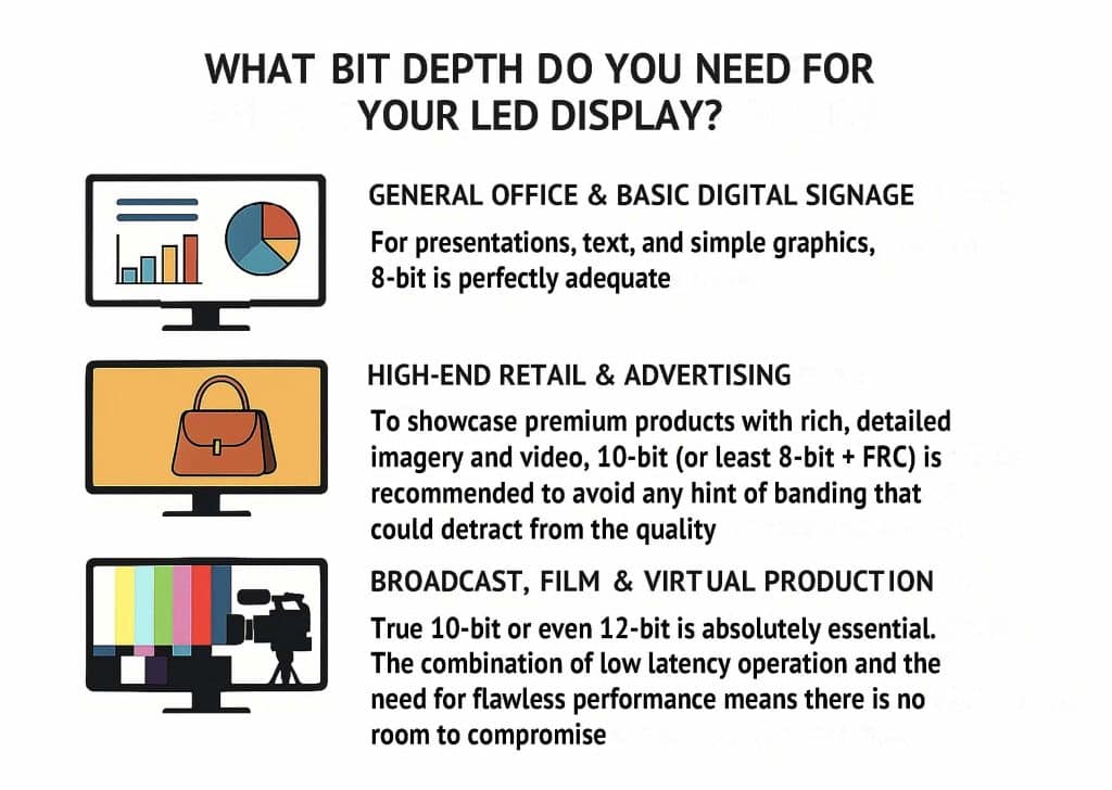
Putting It All Together: What Bit Depth Do You Need For Your LED Display?
The right choice depends entirely on your application:
- General Office & Basic Digital Signage: For presentations, text, and simple graphics, 8-bit is perfectly adequate.
- High-End Retail & Advertising: To showcase premium products with rich, detailed imagery and video, 10-bit (or at least 8-bit + FRC) is recommended to avoid any hint of banding that could detract from the quality of your brand.
- Broadcast, Film & Virtual Production: True 10-bit or even 12-bit is absolutely essential. The combination of low brightness operation and the need for flawless on-camera performance means there is no room for compromise.
Frequently Asked Questions (FAQ)
Q: In simple terms, what is bit depth again?
A: Bit depth is the amount of information used to define the colour of each pixel. Higher bit depth means more information, which translates to a vastly larger number of possible colours and smoother transitions between them.
Q: Is higher bit depth always better?
A: Not necessarily. It depends on your content and application. If your source video is only 8-bit, a 10-bit screen won’t magically improve it. The entire chain, from content creation to the processor and the panel itself, needs to support the higher bit depth.
Q: How do I know what bit depth my content is?
A: Professional video editing and graphic design software will have export settings where you can specify the bit depth. Most consumer content (like videos on YouTube) is 8-bit. Professional camera formats and animation workflows often operate in 10-bit or higher.
Your Path to Perfect Colour
Understanding colour depth is no longer a conversation reserved for broadcast engineers. It’s a fundamental aspect of display technology that impacts everything from a customer’s perception of your brand in a retail store to the quality of a virtual event.
By recognising the tell-tale signs of banding and understanding the “why” behind it, you’re now equipped to ask the right questions and specify the right technology for your projects. You can now look at a display and see not just a picture, but the subtle details that create a truly seamless and impactful visual experience.